
Starbucks unveiled a wordless symbol as its new company logo Wednesday, marking its 40th anniversary and a new era of growth that will include products that may not involve coffee.
The new logo features a close-up of the company’s iconic twin-tailed mermaid, or siren, which has been a part of the logo since the first store opened in Seattle in 1971. Gone, however, are the words “Starbucks Coffee.”
To be rolled out in the spring — Starbucks’ anniversary is in March — the new logo also aims to represent the 16,858-unit coffeehouse chain’s “next chapter,” which it said would include innovation and new distribution channels.
Company officials have said plans include expanding its global consumer packaged goods business; building other brands, such as the secondary Seattle’s Best Coffee platform; as well as tinkering with the existing coffeehouse format by adding beer, wine and additional food offerings to build later daypart sales.
Howard Schultz, Starbucks chairman and chief executive, said in a video statement about the logo change that the new wordless symbol “embraces and respects our heritage and, at the same time, evolves us to a point where we feel it’s more suitable for the future.”
Schultz said that the new logo allowed the siren to “come out of the circle in a way that I think gives us the freedom and flexibility to think beyond coffee.”
“But,” he added, “make no mistake, we have been, we will continue to be and we always will be the world’s leading purveyor of the highest-quality coffee.”
Company officials explained that the siren was inspired by a 16th century Norse wood-cut of the twin-tailed mermaid, evoking a “seductive mystery mixed with a nautical theme.”
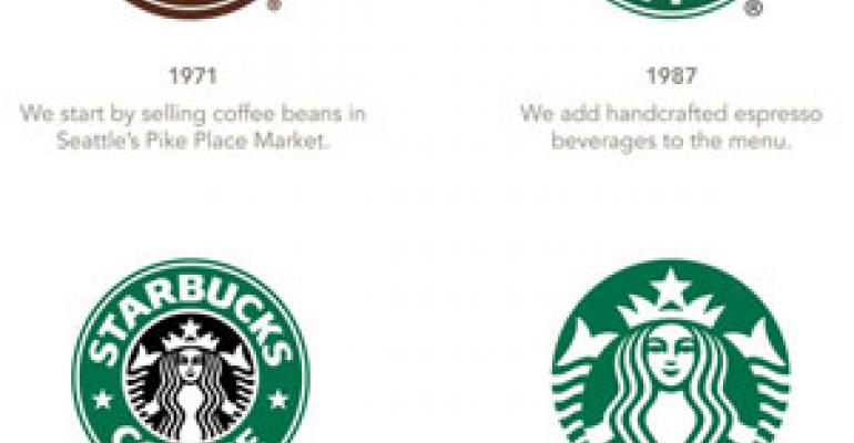
This is the fourth logo change for Starbucks. The original logo in 1971 was brown and featured the words “coffee, tea and spices,” along with a more anatomically realistic representation of the mythical mermaid.
In 1987, when Starbucks began offering espresso-based beverages, the logo turned green and the words “tea” and “spices” were dropped. The mermaid was also redesigned with a more modest presentation.
When the company went public in 1992, the logo changed again, taking a closer look at the siren.
The new logo brings the siren even more into the frame, removing the outer circle and giving her a slightly more cheerful expression.
For its fourth quarter and year ended Oct. 3, Seattle-based Starbucks reported an 86-percent increase in net income for the quarter, saying its earnings per share and consolidated margins were the highest in company history.
Earnings for the quarter were $278.9 million, or 37 cents per share, compared with $150 million, or 20 cents per share, in the same quarter a year ago. Net revenue for the quarter, including an extra week, was up 17.2 percent to $2.8 billion. Same-store sales increased 8 percent.
Contact Lisa Jennings at [email protected].

