El Pollo Loco’s crazy chicken is taking a walk a back in time.
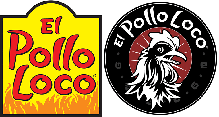
On Monday, Costa Mesa, Calif.-based El Pollo Loco rolled out a new black, white and red corporate logo inspired by the chicken chain’s Los Angeles roots. The company called the retro look “the most significant change in its visual identity since 1980.”
The new oval, retro-looking logo features a chicken at the center with the company’s name incorporating El Pollo Loco’s original legacy typeface.

The old El Pollo Loco logo, left, and the new one
CMO Ed Valle said the new logo reflects “the heart and soul” of El Pollo Loco at a time when dozens of restaurants are going through significant brand refreshes.
“This update is another milestone in the company’s ongoing transformation and reinforces our promise to continually innovate,” Valle said in a statement.
El Pollo Loco began a major brand transformation in December 2016, when it debuted a new look for restaurants. The reimaged “Vision Design” units have scrapped the bright red and yellow colors for rustic hues of gray, white and red. Primary colors, except for red, were also eliminated in the new logo.
The “Vision Design” restaurants feature rustic brick walls, communal seating, Edison-style spider lights and wood beams.
The new logo will gradually roll out to restaurants, the company said, but did not provide a time frame. The logo will also appear on various branding materials including uniforms and packaging.
Contact Nancy Luna at [email protected]
Follow her on Twitter: @FastFoodMaven


