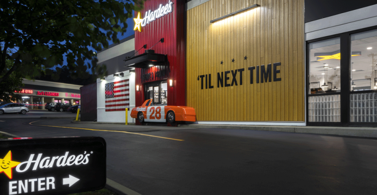
In April, Hardee’s released a new ad campaign and announced its independence from sister chain Carl’s Jr., both owned by Franklin, Tenn.–based CKE Restaurants Holdings Inc.
The tagline for the campaign was “Tastes like America,” and the redesign “celebrates small-town America with the use of genuine textures both inside and out,” according to the company.
The first restaurant to undergo a redesign is in Bellevue, Tenn., and it reopened with a new look on June 1.
Hardee’s redesign was a long time coming. The quick-service chain was founded in Greenville, N.C., in 1960 and was acquired by CKE in 1997. Soon after the purchase, Carl’s Jr. menu items and iconography started appearing at Hardee’s.
“As we went through and looked at the business and the brand, it became obvious they were very separate,” Jason Marker, CEO of CKE, told NRN in April. “They needed their separate identities and, in my opinion, any efficiencies or anything else that was gained by communicating them together was significantly outweighed by the advantages of being totally true to what these brands stand for.”
“Carl's Jr. is very much that impossible to ignore, edgy, bold, aggressive, disruptive brand,” he said. “Hardee's, on the other hand, is…authentic and earnest. We call it downhome food done right.”
Hardee’s has 2,248 locations worldwide.
Contact Gloria Dawson at [email protected]
Follow her on Twitter: @gloriadawson


