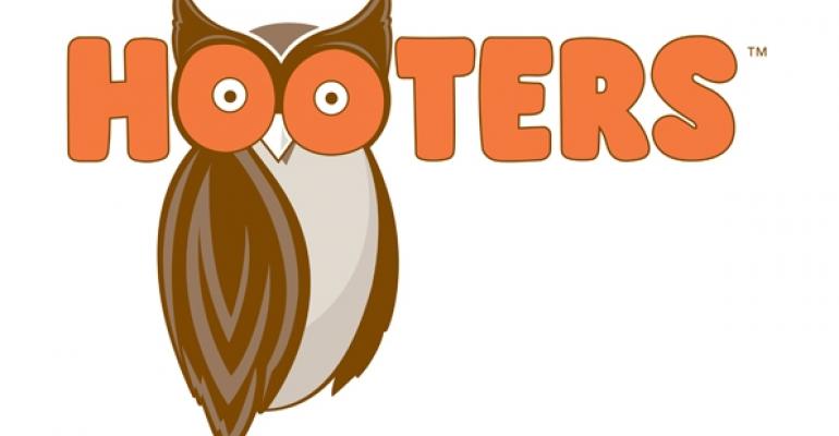
Hooters has redesigned its signature owl logo as part of an ongoing brand overhaul, the company confirmed Thursday.
The new logo takes on a sleeker, more modern look, just like the company’s redesigned stores. The goal of the overall brand refresh is to attract more customers and to welcome more people — women, men, baby boomers, families and teenagers — to the Hooters brand, said chief marketing officer Dave Henninger.
RELATED
• Hooters unveils newly built restaurant prototype
• Hooters debuts late-night menu
• More casual-dining news at NRN.com
Henninger told USA Today that the company wanted to give “Hootie,” the owl in the logo, a “facelift along with the stores.”
However, the logo still contains the tongue-in-cheek sexual reference in the owl’s eyes, Henninger told the newspaper. “The (visual) double entendre remains in place," he said.
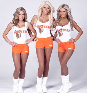
According to a statement by Hooters, the new Hootie image will be rolled out in select markets on Hooters Girls tank tops and menus as early as August. The new image will be introduced “across the board” on Oct. 4, the company said in a statement.

“We have already tested the contemporary design of the new Hootie with our customers, and it was preferred nine to one over our original logo, which will become part of our brand heritage,” Henninger said in the statement.
Last year, the company announced plans to conduct a branding overhaul, including a
re-done menu with more salads and better-for-you options. The new menu items were intended to add more variety to the menu and to get rid of the “veto” vote, Henninger told Nation’s Restaurant News.
Wings remain the core menu item, Henninger said. But salads already make up about 5 percent of the menu mix. Limited-time offers like a blackened mahi mahi sandwich and crab legs are also intended to show that there are non-fried meal options at Hooters, he said.
The company’s redesigned stores moved the bar to the center of the restaurant to make sports viewing more of a priority, too. The redesigned restaurants have a more open, bright feel to them, with big windows and a more modern color palette. Bar stools now have backs, and “floating tables” at booths provided a modern touch.
Additionally, the company is shifting a focus to late-night and alcohol sales instead of beer to increase average check. Daypart and customer-base expansion are key to the company’s future growth.
“Hooters is turning 30 this year, so it seems only fitting to refresh and modernize our restaurants,” Henninger said.
The changes at Hooters also come at a time when other “breastaurant” chains, such as Tilted Kilt and Twin Peaks, are expanding.
Atlanta-based Hooters has more than 400 locations systemwide.
Contact Erin Dostal at [email protected].
Follow her on Twitter: @ErinDostal


